Tom Konrad CFA
Disclosure: Long BEP. Short PEGI $20 and $25 puts, short PEGI $30 and $35 calls, short NYLD $40 and $45 calls.
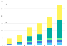
I recently sized up five renewable energy power producers using the metric that’s most often used for solar panels: Dollars per Watt ($/W). It’s an intuitive metric, but has serious flaws both for evaluating solar installations and stocks. Slightly better is Watts per Dollar (or W/$100 to make the numbers look nice) as shown in the chart from that article below.
The main advantage of W/$100 over $/W is that it’s additive: I can meaningfully stack the capacity contributions from various fuel sources. (I.e. ookfield Renewable Energy Partners (NYSE:BEP) has 7 Watts of wind power, 33 Watts of Hydropower, and 2 Watts of cogeneration for every $100 of Enterprise value, for a total of 7+33+2 = 42 Watts of capacity per $100. You can’t perform a similar calculation with the number of dollars you have to invest in BEP to get a Watt of each type of energy production.) That said, W/$100 retains the other disadvantages of $/W, most importantly that different types of power plants are used in different ways.
Baseload plants such as geothermal run nearly constantly, while variable resources such as wind and solar produce variable amounts of power based on climatic conditions. Dams allow hydropower to respond somewhat to demand for power, but run-of-river hydro facilities are totally dependent on water flows, and seasonal and annual flows are dependent on precipitation.
One way to account for all this is to look at annual energy production in GWh per year. The data from the following chart is taken from each company’s 2013 annual report. I had to drop SolarCity (NASD:SCTY) from the list because I could not find energy production data.
Ormat (NYSE:ORA) and NRG Yield (NASD:NYLD) only reported aggregate energy production for 2013, so I made some assumptions based typical capacity factors to allocate production between Ormat’s geothermal and waste heat operations, and between NRG Yield’s wind and solar farms. Ormat’s products business which sells equipment to other geothermal and waste heat recovery operations is scaled based on the relative revenue earned by each segment, while NRG Yield’s thermal businesses provide heat or cooling, and are shown in thermal kWh, which typically have lower value than electrical kWh.
A new category which does not appear in the W/$100 chart is Brookfield Renewable Energy Partners’ (NYSE:BEP) Storage business. This takes advantage of extra capacity in its hydroelectric dams buy pumping water back behind the dam when during times of low electricity demand, and allowing that water to flow back through the turbine and generate electricity when demand it high.
It’s interesting to note that Ormat and Brookfield look most attractive when evaluated on annual energy production, while NRG Yield looked best based on capacity. This is because hydropower and geothermal are typically being used at closer to their potential output more of the time than solar and wind, and much more than NRG Yield’s thermal assets. This variation is captured by a power plant’s “capacity factor,” which is the percentage of its theoretical maximum production it actually achieves.
The following chart shows the capacity factors actually achieved by these four companies in 2013:
Note that I had to guess at the relative capacity factors for NRG Yield’s wind and solar operations, since the company only provides aggregate energy production data. In any case, NRG’s total renewable energy production is large relative to its renewable energy capacity, so we can conclude that its wind and solar farms are in good locations for those resources. There were no such complications with PAttern Energy Group (NASDAQ:PEGI) since all of its generation is wind power.
Final Thoughts
Annual energy production is still a very incomplete picture of the value of these company’s operations. The value of electricity depends greatly on local market conditions, as well as the time and season. Nor do any of these charts include the companies’ expansion plans.
Can we conclude anything from this series of charts comparing power produces by $/W, W/$100, annual kWh/$, and capacity factor? Perhaps only that it’s impossible to sum up a company’s operations in a single number, or even a hundred numbers. Not that this will be a surprise to anyone who has cracked open a company’s annual report.
On the other hand, I never know what I’ll find when I decide to look at companies using a new metric.
DISCLAIMER: Past performance is not a guarantee or a reliable indicator of future results. This article contains the current opinions of the author and such opinions are subject to change without notice. This article has been distributed for informational purposes only. Forecasts, estimates, and certain information contained herein should not be considered as investment advice or a recommendation of any particular security, strategy or investment product. Information contained herein has been obtained from sources believed to be reliable, but not guaranteed.


